
A business card is more than just a small piece of paper with contact details—it is a reflection of your brand, professionalism, and attention to detail. In a world dominated by digital communication, the business card remains a powerful tool for networking and leaving a lasting impression. A well-designed business card not only provides essential information but also conveys credibility and brand identity. This article explores the key elements of creating a business card that maximizes impact and ensures you stand out in any professional setting.
Understanding the Purpose of a Business Card
A business card serves as a tangible representation of your professional identity. It allows potential clients, partners, and colleagues to remember you after an initial meeting. While digital communication is essential, a business card adds a personal touch that is hard to replicate through emails or social media. It acts as a visual reminder of your brand and a convenient way for people to store your contact information.
Choosing the Right Size and Shape
The traditional business card size is 3.5 x 2 inches, making it easy to fit in wallets and cardholders. However, exploring unique shapes can make your business card stand out. Rounded edges, square cards, and custom die-cut shapes can enhance visual appeal, but it’s important to ensure they remain practical and easy to carry.
Selecting the Best Material
The choice of material significantly affects the perception of your business card. Common options include:
- Standard Cardstock: A classic choice that balances cost and quality.
- Textured Paper: Adds a tactile element, making the card feel premium.
- Plastic Cards: Durable and resistant to wear and tear.
- Eco-Friendly Options: Recycled paper or biodegradable materials appeal to environmentally conscious clients.
Typography and Readability
Typography plays a crucial role in making your business card readable and professional. When selecting fonts:
- Choose a clean, professional typeface.
- Use a font size that is easy to read.
- Limit the number of fonts to maintain a cohesive look.
- Ensure good contrast between text and background colors.
Color Psychology in Business Cards
Colors influence perception and can evoke emotions. The right color scheme strengthens brand identity and ensures your business card is memorable.
- Blue: Trust, reliability, and professionalism (ideal for finance and corporate industries).
- Red: Energy, passion, and urgency (great for marketing and creative fields).
- Green: Growth, sustainability, and health (perfect for wellness and environmental brands).
- Black & White: Elegance and simplicity (suitable for luxury brands and minimalistic designs).
The Power of Minimalist Design
A clutter-free business card looks modern and professional. Essential elements include:
- Name and designation
- Contact details (phone number, email, website)
- Company name and logo
- A simple yet impactful layout Avoid unnecessary elements that can distract from the core message.
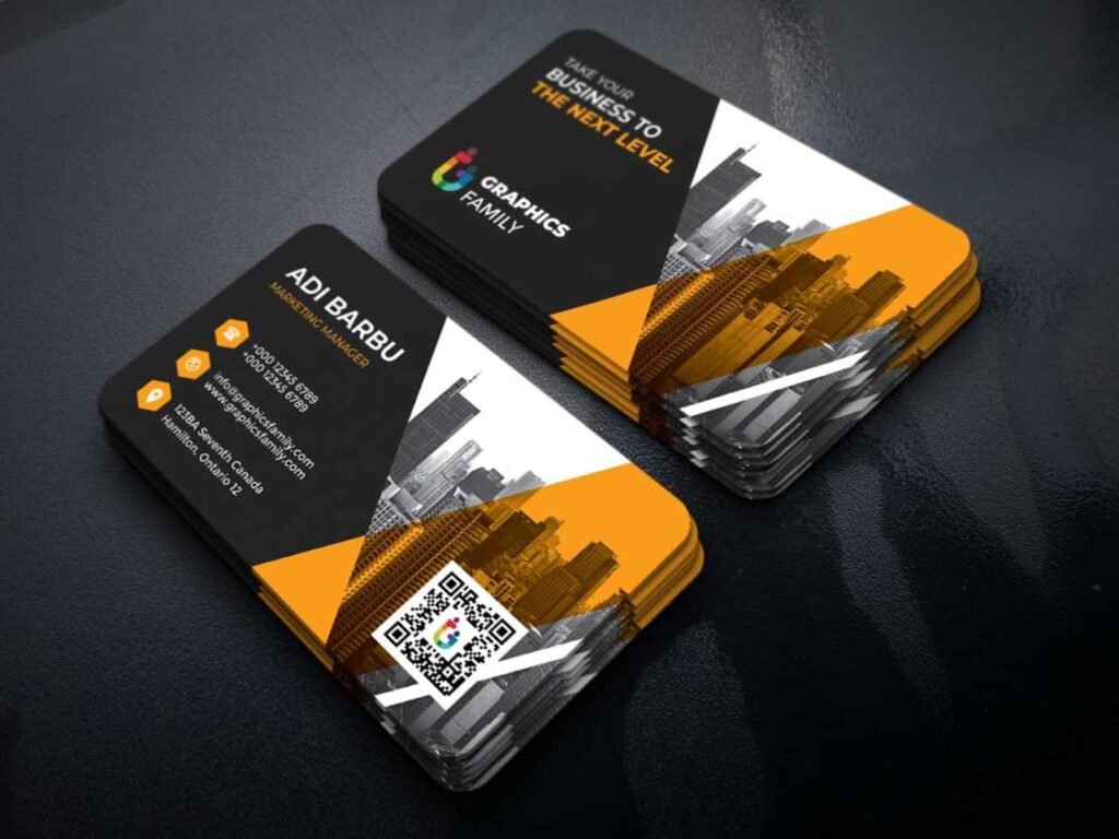
The Role of Images and Logos
A business card without a logo feels incomplete. A well-designed logo adds credibility and reinforces brand recognition. High-resolution images or subtle background textures can enhance visual appeal without overpowering essential information.
Essential Information to Include
Every business card should contain:
- Full name and professional title
- Phone number and email address
- Business address (if applicable)
- Website and social media handles Providing only relevant information prevents overcrowding and maintains clarity.
The Importance of White Space
White space (empty areas without text or images) enhances readability and creates a balanced design. A crowded business card can be overwhelming, making it difficult for recipients to locate key details.
Special Finishes for a Unique Look
Adding special finishes can make your business card more memorable. Popular options include:
- Embossing/Debossing: Raised or recessed text for a tactile feel.
- Foil Stamping: Metallic effects that add a luxurious touch.
- Spot UV: Glossy highlights on specific areas.
- Matte vs. Glossy Finishes: Matte for a sophisticated look; glossy for vibrant colors.
Double-Sided vs. Single-Sided Cards
A double-sided business card provides extra space for branding, while a single-sided card offers simplicity. Consider placing key contact details on one side and additional information, such as a tagline or QR code, on the other.
QR Codes and Interactive Elements
Adding a QR code allows recipients to instantly access your website, social media, or digital portfolio. Ensure the QR code is not too large and blends seamlessly with the design.
Industry-Specific Business Card Designs
Different industries have unique expectations for business card design:
- Corporate and Finance: Clean, minimalistic designs with subtle colors.
- Creative Industries: Bold colors, unique shapes, and artistic elements.
- Tech Startups: Modern layouts with digital enhancements like NFC chips.
- Health and Wellness: Soothing color schemes and organic design elements.
Printing Techniques and Quality Control
The quality of printing impacts the final result. Consider:
- Digital Printing: Cost-effective for small batches.
- Offset Printing: High-quality results for large quantities.
- Letterpress Printing: Adds a handcrafted feel. Before finalizing, check for errors, alignment issues, and print quality to ensure a polished look.
How to Distribute Business Cards Effectively
A business card is only useful if it reaches the right people. Tips for effective distribution:
- Always carry a stack with you.
- Hand them out at networking events and conferences.
- Include them in packaging or direct mail campaigns.
- Leave them at relevant business locations.
Digital Business Cards vs. Traditional Business Cards
Digital business cards are gaining popularity, but physical cards still hold value. Pros of Digital Business Cards:
- Easily shareable via email or QR codes.
- Cost-effective with no printing expenses.
- Editable and updatable in real time.
Pros of Traditional Business Cards:
- Tangible and personal.
- No need for internet access.
- Creates a stronger first impression.
Using both options ensures a versatile approach to networking.
Common Mistakes to Avoid
Avoid these common pitfalls when designing a business card:
- Too Much Information: Keep it concise and relevant.
- Poor-Quality Printing: Low-resolution images and thin paper can make a bad impression.
- Overly Complex Designs: Simplicity often has the strongest impact.
- Using Outdated Details: Ensure phone numbers, email addresses, and websites are up to date.
Updating and Redesigning Your Business Card
It’s important to update your business card periodically to reflect changes in branding, contact details, or industry trends. Signs it’s time for a refresh:
- Rebranding or logo updates
- New job title or company details
- Outdated design that no longer represents your brand effectively
Conclusion
A well-designed business card leaves a lasting impression and serves as a powerful networking tool. By carefully selecting materials, colors, typography, and layout, you can create a business card that effectively represents your brand and professional identity. Whether you opt for traditional or digital business cards, maintaining high quality and clarity ensures that your card makes an impact every time you hand it out.